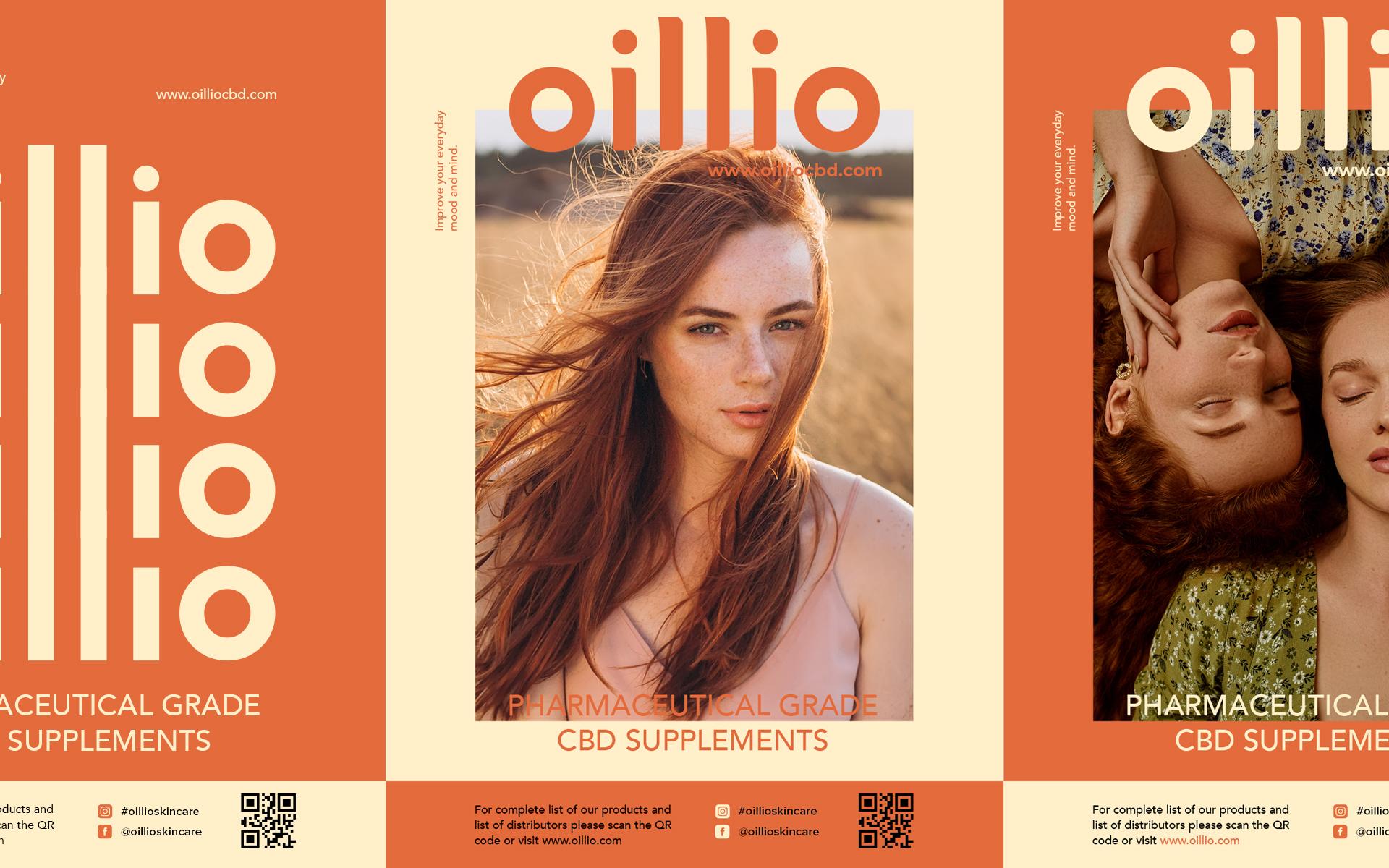
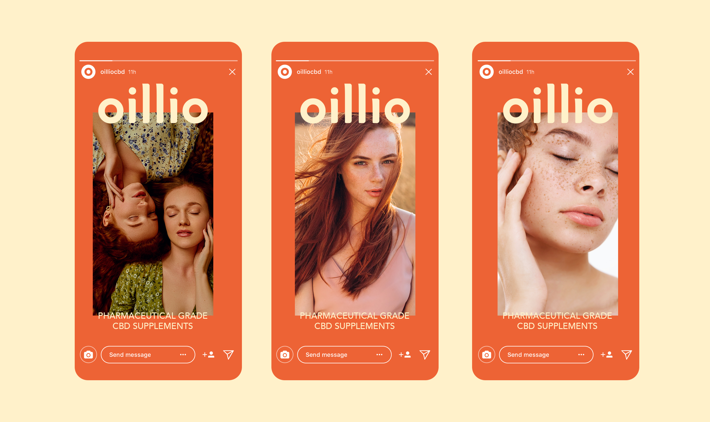
The challenge presented by Oillio Company was to develop a logo design that stands alone effectively, even when applied to packaging or branding materials without supplementary elements. The objective was to craft a logo that strikes the perfect balance between minimalist aesthetics and distinctive personality.
The name “Oillio” provided a unique opportunity to leverage its inherent symmetry in the logo design. This symmetry offered creative freedom to develop a distinctive and cohesive visual identity. By capitalizing on the symmetrical nature of the name, we were able to design a bespoke illustration typeface that maintains the integrity of the logo while seamlessly integrating into various patterns and backgrounds.