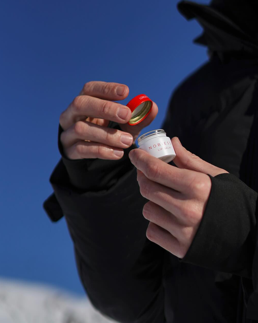
Nobiesse has developed a comprehensive range of “do-no-harm” products, meticulously designed for individuals who recognize that the substances applied to their skin play a crucial role in their overall well-being. We ensured that this vision was seamlessly integrated into the branding and packaging of their luxurious skincare lineup, reflecting both the elegance and the commitment to safety that define Nobiesse.
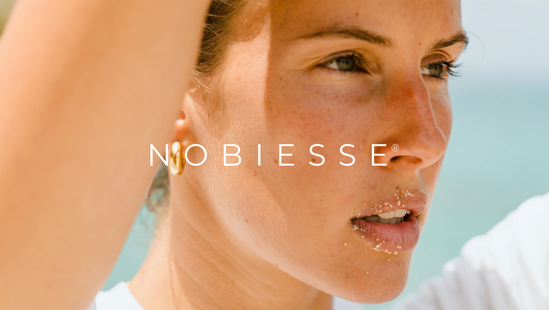
In alignment with the Nobiesse® brand personality, we at Frkka aimed to create skincare packaging that exudes authenticity and caters to individuals who prioritize the highest standards of skin and overall health care. The packaging is thoughtfully crafted to resonate with those committed to achieving optimal well-being through accessible and premium skincare solutions.
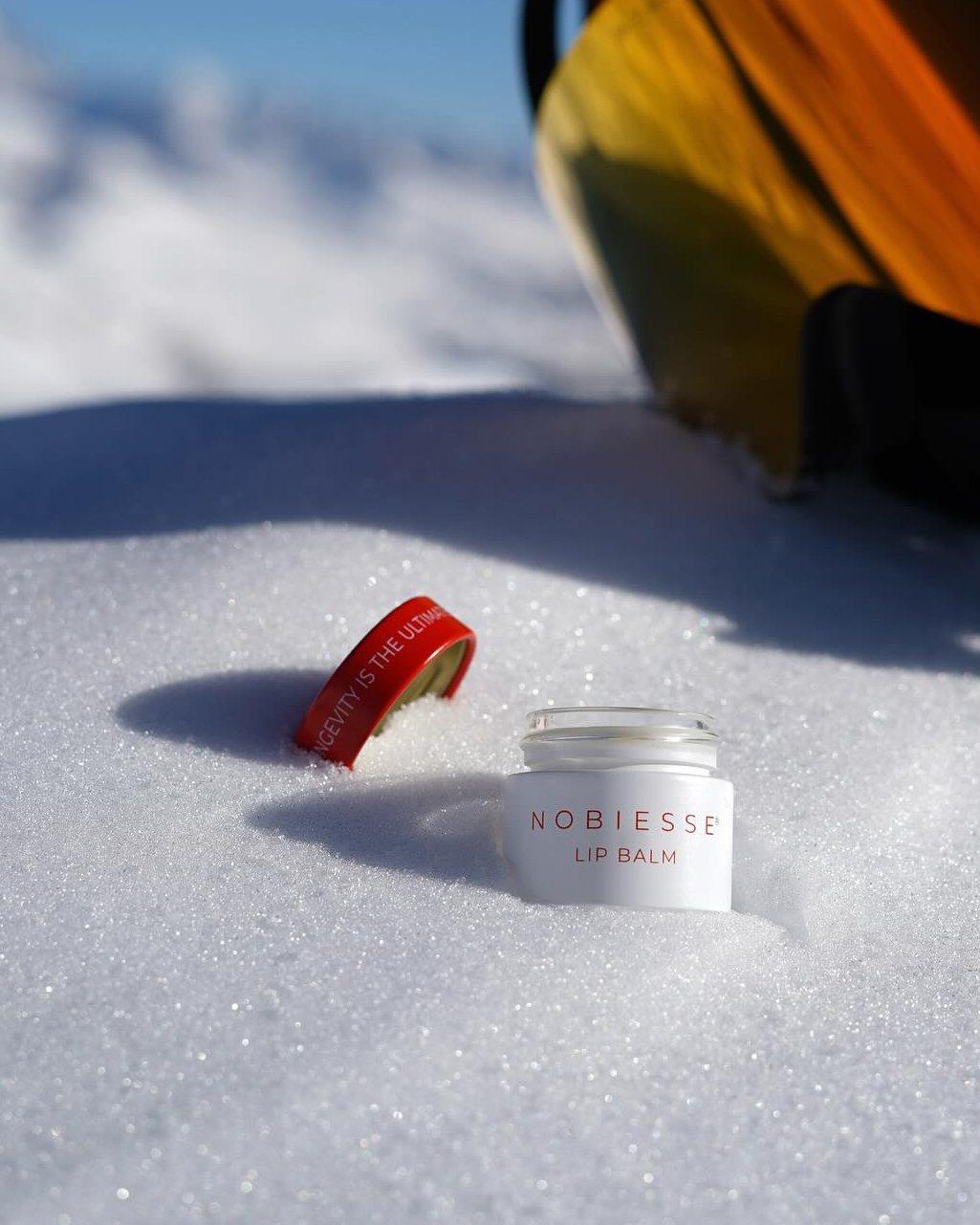
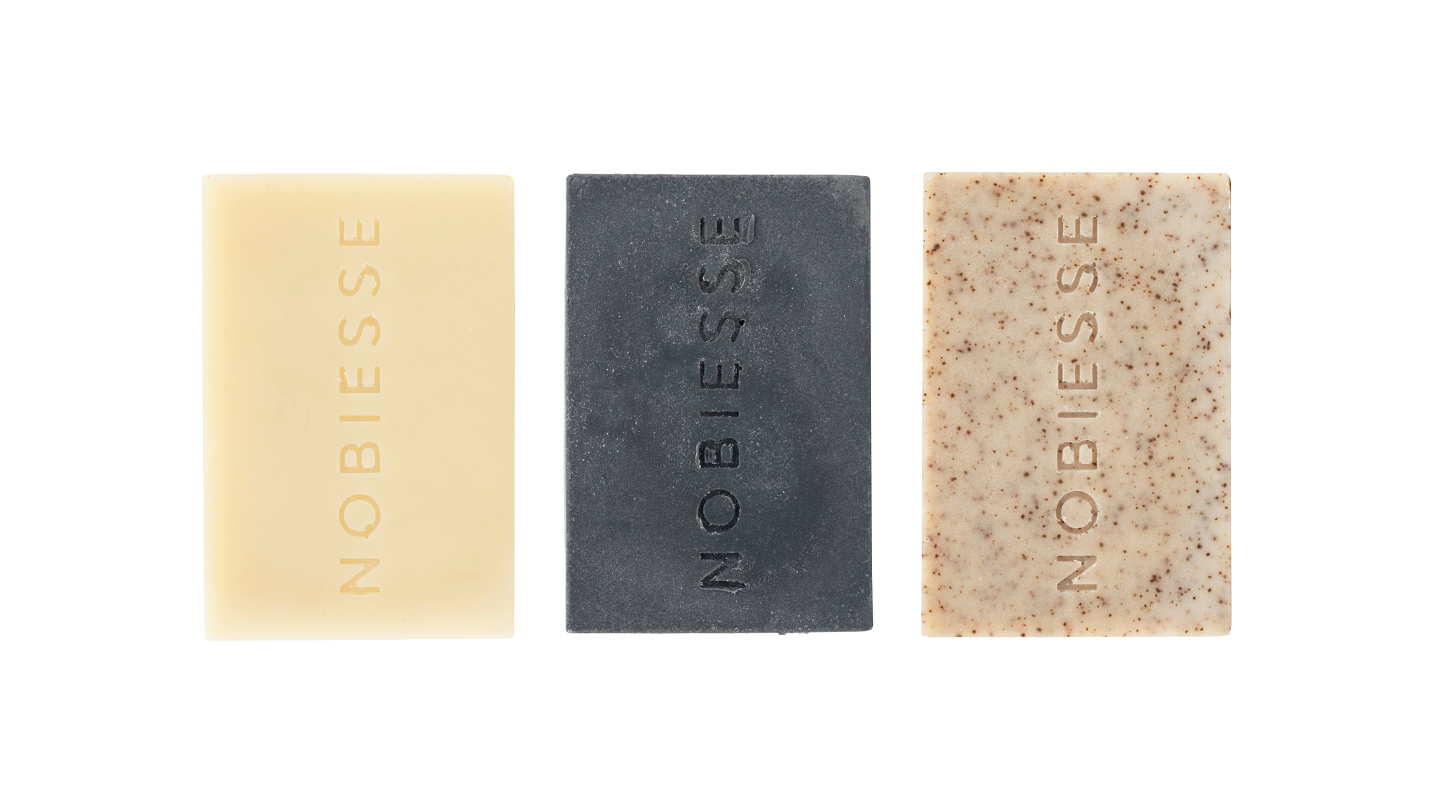
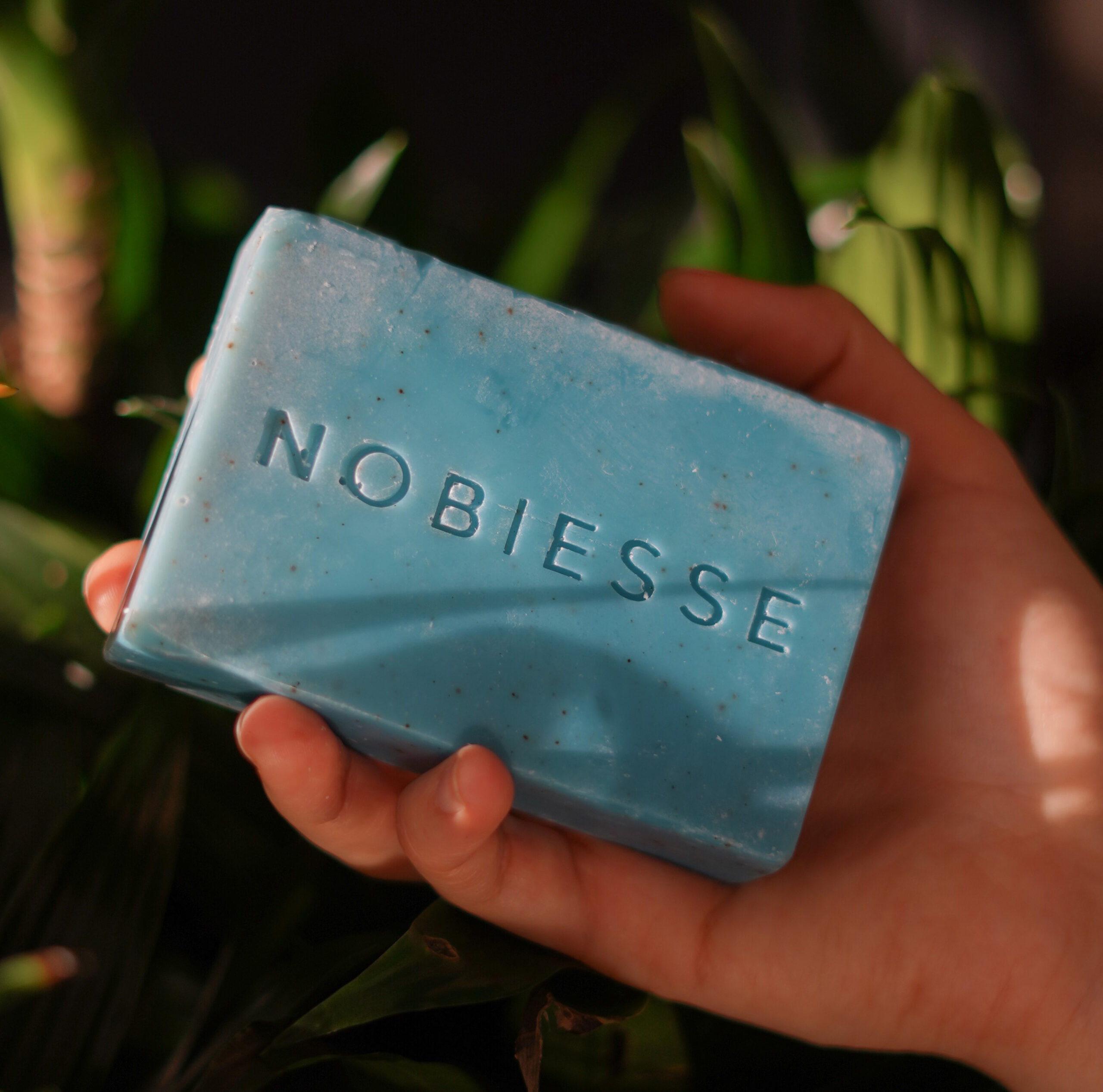
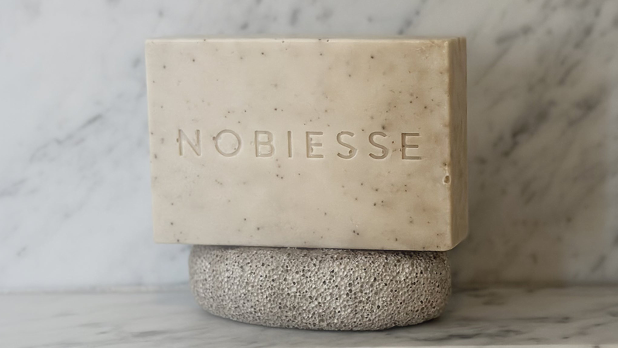
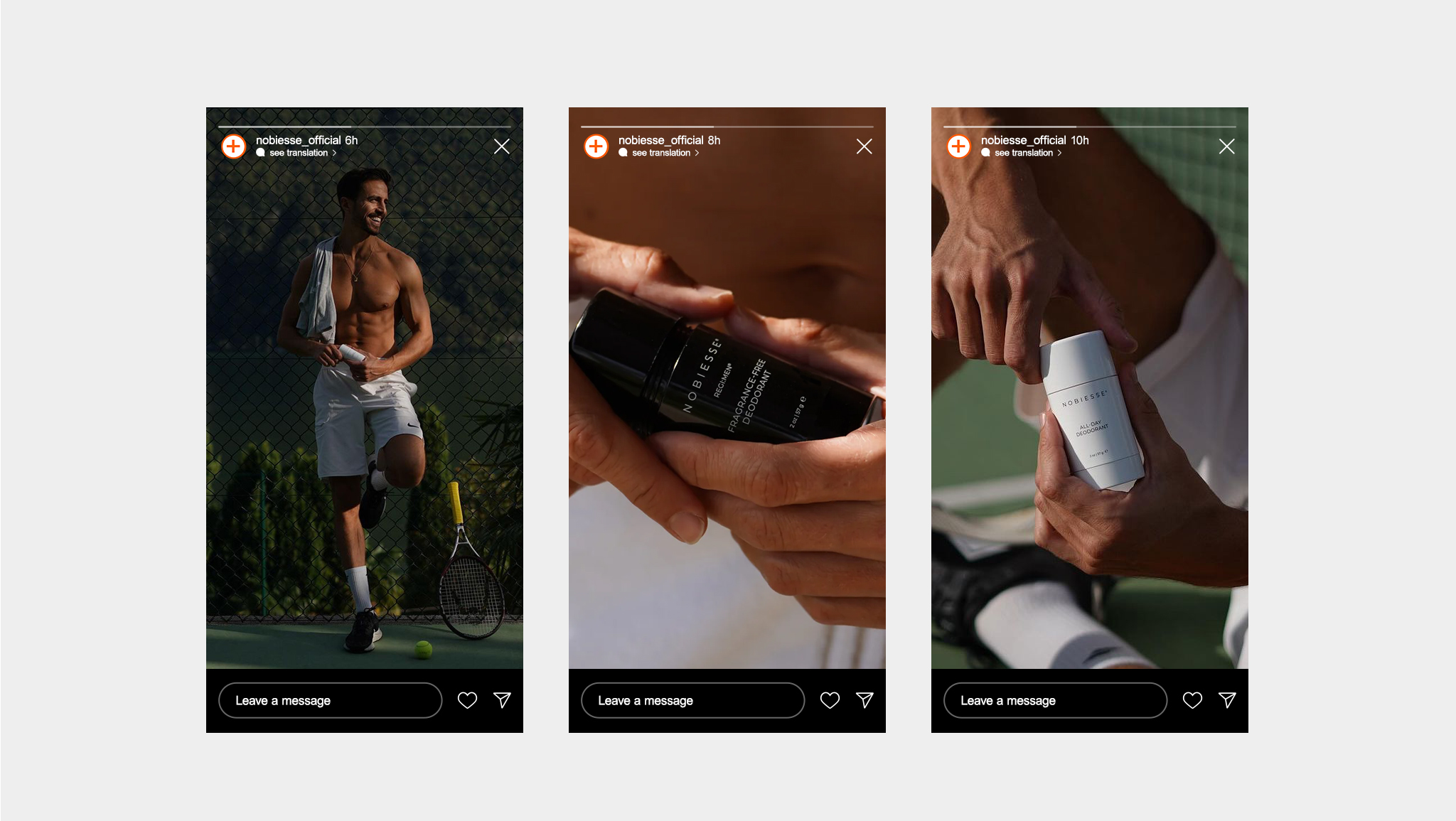
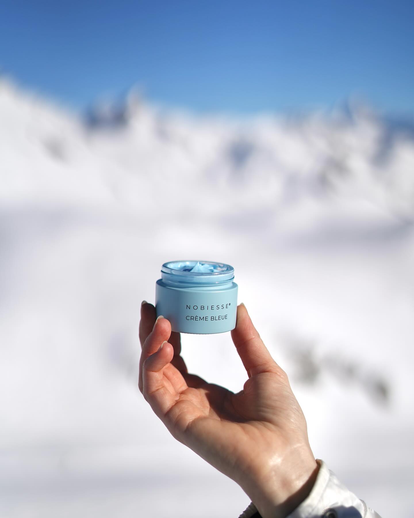
The product names and branding for Nobiesse® are characterized by their honesty and clarity, explicitly communicating the use of clean and natural ingredients expertly formulated by skincare and dermatology professionals. The design remains minimalist to ensure that our products stand out distinctly and are easily distinguishable from other brands.
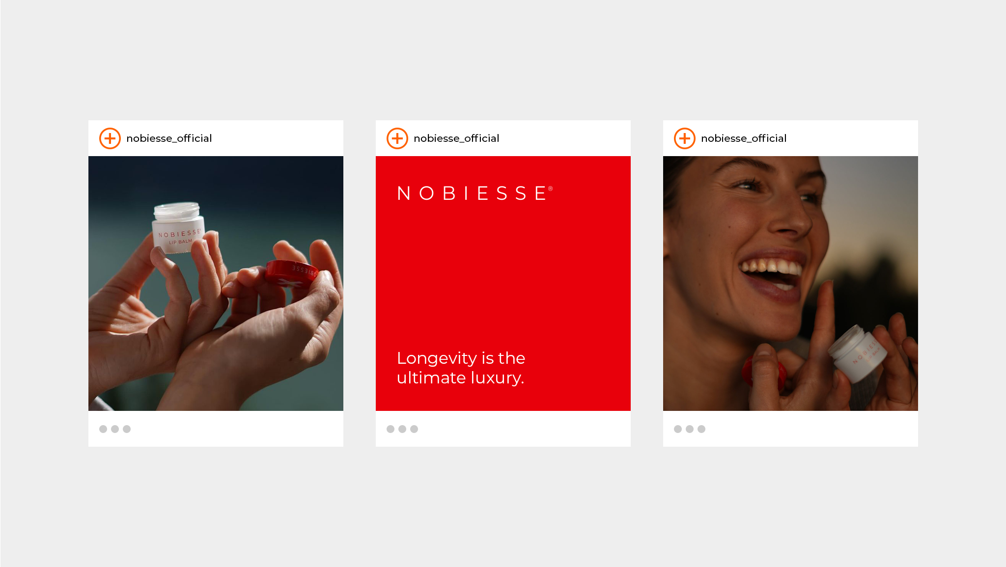
The use of vivid colors against a white background, combined with minimalist typography, effectively establishes a strong brand identity. This design approach ensures that Nobiesse® stands out distinctly on the shelf, making it immediately recognizable and unmistakable to consumers.